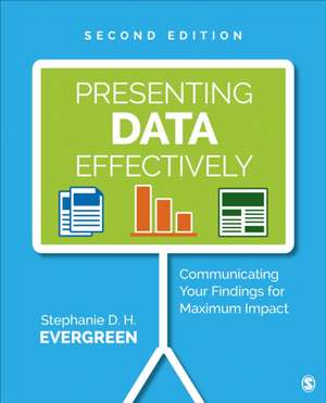
Presenting Data Effectively: Communicating Your Findings for Maximum Impact
Autor Stephanie Evergreenen Limba Engleză Paperback – 26 iul 2017
NEW TO THIS EDITION:
- A new checklist provides guidelines to help readers develop their skills in visualizing data.
- Revised content on text addresses font sizes, how to handle text in graphs, and which fonts to use and not use.
- A rewritten chapter on color now incorporates guidance for complying with the Americans with Disabilities Act.
- A chapter on arrangement now addresses how to construct reporting that aligns with a mobile reading culture.
- An easy-to-follow format and straightforward content make it easy for readers to understand the strategies covered in the book.
- A focus on what works for memory and comprehension gives readers a way to show how meaningful their data really are.
- Cutting-edge examples and applications from several social sector fields bring concepts to life.
- Guidance based on Microsoft Office products makes it easy to implement the suggestions and examples without purchasing new programs or learning new applications.
- Before and after illustrations of reporting techniques with diagnostic step-by-step instructions for replication give readers hands-on experience.
- Examples of good communication in various reporting mechanisms, such as posters, PowerPoint and online presentations, and reports, introduce readers to best practices material.
Access helpful tools and resources all in one place (http://study.sagepub.com/evergreen2e), including:
- A research & evaluation report layout checklist
- A data visualization checklist
- Templates of style sheets
- A PowerPoint template on the “rule of thirds”
- A slide deck planning sheet
Preț: 513.61 lei
Preț vechi: 658.48 lei
-22% Nou
98.32€ • 101.12$ • 81.57£
Carte disponibilă
Livrare economică 25 ianuarie-08 februarie
Livrare express 14-18 ianuarie pentru 33.51 lei
Specificații
ISBN-10: 1506353126
Pagini: 280
Dimensiuni: 187 x 232 x 14 mm
Greutate: 0.57 kg
Ediția:Second Edition
Editura: SAGE Publications
Colecția Sage Publications, Inc
Locul publicării:Thousand Oaks, United States
Recenzii
Cuprins
Acknowledgments
Preface to the Second Edition
1 The Justification for Presenting Data Effectively
Learning Objectives
What Does Effective Data Presentation Look Like?
What Makes Data Presentation Effective?
What Do I Need to Develop Effective Data Presentation?
How Do I Navigate This Book?
What Is the Bottom Line?
Key Points to Remember
How Can I Extend This?
Where Can I Go for More Information?
2 Graphics
Learning Objectives
Guiding Ideas
How Do I Use Images in Effective Ways?
How Do I Efficiently Locate High-Quality Images?
Where Should Graphs Go?
How Do I Apply These Ideas to Graphs?
What Is the Bottom Line?
Key Points to Remember
How Can I Extend This?
Where Can I Go for More Information?
3 Text
Learning Objectives
Guiding Ideas
What Is Type?
How Do I Tell These Typefaces Apart?
What Works for Paper and What Works for Screen?
Did You Just Say I Can’t Use Calibri?
How Can I Protect Font Choices?
How Do Fonts Actually Communicate?
What Font Size Should I Use?
How Should Lines Be Spaced?
How Does Typeface Help Organize Data Presentation?
How Do I Apply These Ideas to Graphs?
What Is the Bottom Line?
Key Points to Remember
How Can I Extend This?
Where Can I Go for More Information?
4 Color
Learning Objectives
Guiding Ideas
Why Is Color Important to Memory?
What Colors Should I Choose?
What Should I Watch Out For?
How Do I Apply Emphasis Colors?
How Do I Apply These Ideas to Graphs?
What Is the Bottom Line?
Key Points to Remember
How Can I Extend This?
Where Can I Go for More Information?
5 Arrangement
Learning Objectives
Guiding Ideas
Where Do the Bits and Pieces Go?
What Is White Space and How Do I Use It?
How Should I Justify Text?
How Can I Align Using Typical Software?
When Is It Okay to Break the Rules?
How Do I Arrange the Sections of the Whole Report?
How Do I Apply These Ideas to Graphs?
What Is the Bottom Line?
Key Points to Remember
How Can I Extend This?
Where Can I Go for More Information?
6 Making It Easy
Learning Objectives
Criticism: Trying to Look Slick
Criticism: Design Is Expensive
Key Points to Remember
How Can I Extend This?
Where Can I Go for More Information?
Appendix A Report Layout Checklist
Appendix B Data Visualization Checklist
Index
Notă biografică
Dr. Stephanie D. H. Evergreen is a sought-after speaker, designer, and researcher. She is best known for bringing a research-based approach to helping others better communicate their work through more effective graphs, slides, and reports. She holds a PhD from Western Michigan University in interdisciplinary research, which included a dissertation on the extent of graphic design use in written data reporting. Dr. Evergreen has trained audiences worldwide through keynote presentations and workshops for clients, such as Verizon, Head Start, American Institutes for Research, Brookings Institute, the Ad Council, Boys and Girls Club of America, and the United Nations. She led the first known attempt to revamp the quality of presentations for an entire association: the Potent Presentations Initiative for the American Evaluation Association (AEA). She is the 2015 recipient of the AEA¿s Marcia Guttentag Promising New Evaluator Award, which recognizes early notable and substantial accomplishments in the field. Dr. Evergreen is coeditor and coauthor of two issues of New Directions for Evaluation on data visualization. She writes a popular blog on data presentation at StephanieEvergreen.com. Her book, Presenting Data Effectively: Communicating Your Findings for Maximum Impact, was published by Sage in Fall 2013 and was listed as number one in Social Science Research on Amazon in the United States and United Kingdom for several weeks.
