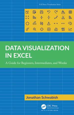
Data Visualization in Excel: A Guide for Beginners, Intermediates, and Wonks: AK Peters Visualization Series
Autor Jonathan Schwabishen Limba Engleză Paperback – 31 mai 2023
| Toate formatele și edițiile | Preț | Express |
|---|---|---|
| Paperback (1) | 182.33 lei 3-5 săpt. | +29.03 lei 4-10 zile |
| CRC Press – 31 mai 2023 | 182.33 lei 3-5 săpt. | +29.03 lei 4-10 zile |
| Hardback (1) | 433.36 lei 6-8 săpt. | |
| CRC Press – 31 mai 2023 | 433.36 lei 6-8 săpt. |
Preț: 182.33 lei
Preț vechi: 227.91 lei
-20% Nou
Puncte Express: 273
Preț estimativ în valută:
34.89€ • 36.29$ • 28.81£
34.89€ • 36.29$ • 28.81£
Carte disponibilă
Livrare economică 25 martie-08 aprilie
Livrare express 08-14 martie pentru 39.02 lei
Preluare comenzi: 021 569.72.76
Specificații
ISBN-13: 9781032343266
ISBN-10: 1032343265
Pagini: 400
Ilustrații: 66 Tables, black and white; 30 Line drawings, color; 319 Halftones, color; 349 Illustrations, color
Dimensiuni: 174 x 246 x 22 mm
Greutate: 0.88 kg
Ediția:1
Editura: CRC Press
Colecția A K Peters/CRC Press
Seria AK Peters Visualization Series
ISBN-10: 1032343265
Pagini: 400
Ilustrații: 66 Tables, black and white; 30 Line drawings, color; 319 Halftones, color; 349 Illustrations, color
Dimensiuni: 174 x 246 x 22 mm
Greutate: 0.88 kg
Ediția:1
Editura: CRC Press
Colecția A K Peters/CRC Press
Seria AK Peters Visualization Series
Public țintă
Adult education, General, Postgraduate, Professional, Undergraduate Advanced, and Undergraduate CoreRecenzii
"Microsoft Excel is already installed on 750 million computers. But creating modern visualizations using Excel charts seems impossible. In this book, Jonathan Schwabish gives you the step-by-step instructions to make Excel charts do what most people (including me) previously thought was impossible in Excel. Every chapter, you will learn how to make visualizations that most people assume require Python or R."
--Bill Jelen, Excel MVP and publisher of MrExcel.com
“Those who expanded their graphicacy with Schwabish's Better Data Visualizations are going to love the follow up, in which Jon outlines how to make graphs using the ubiquitous Microsoft Excel. Readers will appreciate Jon's pragmatic examples, easy-to-follow instructions and entertaining writing. If you need to communicate with data and lack confidence making graphs in Excel, I urge you to add Data Visualization in Excel to your library!”
--Cole Nussbaumer Knaflic, founder and CEO of storytelling with data (SWD)
“Wow, just wow. One book that explains how to make all the fancy, powerful charts you see in good ol' Excel. If you want to impress your boss with Excel charting wizardry, this is THE BOOK for you. Not only does the book explain the chart construction process, it also provides guidance on designing great outputs. I wish I had this book when I started my data analyst journey. A must buy. Highly recommended.”
--Chandoo (Purna Duggirala), Microsoft MVP, Chandoo.org
"This book takes you well beyond the defaults of Excel charting. It shows you how to apply principles and best practices of data visualization in an accessible way. In the process it streamlines the use of Excel while enabling the creation of much more advanced graphics."
--Jon Peltier, Peltier Technical Services
“Thank you Jonathan Schwabish for giving us such a clear how-to book! Data Visualization in Excel shows us how far we can go with Excel to make data visualization insights accessible to a much broader audience! I am making this my go-to textbook for teaching myself and my students to create better, more effective, and different graphs in Excel to operationalize the data visualization concepts and strategies the earlier books have inspired in us.”
-- Kosali Simon, Distinguished Professor, Indiana University, O’Neill School of Public and Environmental Affairs
"There aren’t many places where the cliché “think outside the box” can be applied with such propriety (and benefits) than when making charts in Excel. If you go beyond its poor chart library and defaults, there is a whole world to discover, and Jon’s new book is a great journey companion. This detailed step-by-step tutorial will show you how to take advantage of Excel’s flexibility, how to use design and formatting options far from their original intent and how to visualize data directly on the spreadsheet, going even further away from the chart library. On top of this, Jon is a communicator and a data visualization expert, so his many examples are relevant (many analytical tasks can benefit from them) and designed for effectiveness applying sound data visualization guidelines."
-- Jorge Camões, data visualization consultant, founder of Excelcharts.com
"For data visualisation practitioners looking to hone their charting craft there are three core questions: what, when, and how. What different options exist. When should I use. How do I make them. Jon’s bestseller "Better Data Visualizations: A Guide for Scholars, Researchers, and Wonks” addresses the first two of those enquiries, and much more besides, but this excellent new text gives explicit solutions for the matter of how. For Excel users, beginners or advanced, this book will become an essential practical companion. You’ll learn how to elegantly master the standard charting functions in the most effective and efficient way, but you’ll also discover how to truly make Excel sing, finding novel approaches and clever workarounds to expand your visual vocabulary even further."
--Andy Kirk, independent consultant, educator, and author, founder of visualisingdata.com
"I found this book 20 years too late! Seriously, I wish I had this book a long time ago, for its rich collection of tutorials, best practices, lessons learned, and principles of data visualization using Excel. From broken stacked bars to Gantt charts, heatmaps, tile grid maps, and waffle plots (and so much more from A to Z), the many detailed visualization examples in this book will provide tremendous benefit in the workplace whenever and wherever data storytelling, visual analytics, or data-driven decision insights are required. Excel users from beginners to experts will discover useful data visualization examples, corresponding detailed instructions, and perhaps some secrets of Excel here in this wonderful book."
--Kirk Borne, Chief Science Officer, DataPrime Inc.
"Jonathan Schwabish taught me what constitutes a good chart. In this incredibly useful volume, he teaches me how to make a good chart in Excel. A step-by-step guide – practical, easy to follow and (of course) well-illustrated."
--David Wessel, Director, Hutchins Center on Fiscal & Monetary Policy, The Brookings Institution
"Finally, a comprehensive data visualisation book for Excel that’s detailed enough that a relative beginner can use it, and extensive enough that an experienced user will also discover tips and learn valuable Excel techniques and data visualisation best practices."
--Mynda Treacy, MyOnlineTrainingHub.com
"Data visualization has an ever-growing toolbox of applications and programming languages for creating charts, but some may come with steep learning curves, some may require coding skills, and some resources may lack the full range of functionality we really need. The one, often overlooked tool familiar and often available to most of us is Microsoft Excel. In this companion book to Better Data Visualizations: A Guide for Scholars, Researchers and Wonks, Jon Schwabish systematically and expertly shows us how to create a wide variety of visualization types, from simple heatmaps right through to more complex examples such as raincloud plots and Marimekko charts, each with detailed tutorials and with all companion resources available via his website. This book first opens your eyes to the wide range of visualization possibilities that were most likely available to you all along in Excel, then promptly equips you with the skills to create them all."
--Neil Richards, Lead Business Intelligence Analyst at JLL, former Knowledge Director for the Data Visualization Society
Notă biografică
JONATHAN SCHWABISH is an economist and data communication expert. Dr Schwabish is considered a leader in the data visualization field and is a leading voice for clarity and accessibility in research. He is a senior fellow at the Urban Institute, a non-profit research institution in Washington, D.C., and is the founder of the data visualization and presentation skills firm, PolicyViz.
Cuprins
Acknowledgements. PART ONE: SETTING THE STAGE. 1. Introduction. 2. How to Use This Book. 3. The Philosophy of Data Visualization in Excel. 4. Introduction to Making Graphs in Excel. 5. Fundamental Formulas Used in Building Your Graphs. 6. Building a Custom Color Palette in Excel. PART TWO: MAKING GRAPHS IN EXCEL. 7. Sparklines. 8. Heatmap. 9. Stripe Chart. 10. Waffle Chart. 11. Gantt Chart. 12. Comparing Values with Two Graph Types. 13. Broken Stacked Bar Chart. 14. Diverging Bar Chart. 15. Block Shading (Same Frequency). 16. Block Shading (Different Frequencies). 17. Mark an Event with a Line. 18. Dot Plot. 19. Slope Chart. 20. Overlaid Gridlines. 21. Lollipop Chart. 22. Bullet Chart. 23. Tile Grid Map. 24. Histogram. 25. Marimekko Chart. 26. Cycle Plot. 27. Strip Chart. 28. Raincloud Plot. 29. Making Better Tables. PART THREE: MOVING VISUALS OUT OF EXCEL. 30. Exporting Graphs from Excel. 31. Redesigns and Examples. 32. Conclusion. Appendix 1. Color Tools. Appendix 2. Data Visualization Tools. Appendix 3. Additional Excel Resources. Appendix 4. Quick Instructions List. References. Index.
Descriere
Data Visualization in Excel provides a step-by-step guide to creating more advanced and often more effective data visualizations in Excel and is the perfect guide for anyone who wants to create better, more effective, and more engaging data visualizations.
