Cantitate/Preț
Produs

HTML5 and CSS3 Building Responsive Websites

Autor Thoriq Firdaus, Ben Frain, Benjamin Lagrone
en Limba Engleză Paperback – 30 ian 2017
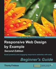
Design robust, powerful, and above all, modern websites across all manner of devices with ease using HTML5 and CSS3 Key Features:Use Responsive Grid System, Bootstrap, and Foundation frameworks for responsive web design Learn how to use the latest features of CSS including custom fonts, nth-child selectors (and some CSS4 selectors), CSS custom properties (variables), and CSS calc Make a mobile website using jQuery mobile and mobile-first design Book description: Responsive web design is an explosive area of growth in modern web development due to the huge volume of different device sizes and resolutions that are now commercially available. The Internet is going mobile. Desktop-only websites just aren't good enough anymore. With mobile internet usage still rising and tablets changing internet consumption habits, you need to know how to build websites that will just "work," regardless of the devices used to access them. This Learning Path course explains all the key approaches necessary to create and maintain a modern responsive design using HTML5 and CSS3. Our first module is a step-by-step introduction to ease you into the responsive world, where you will learn to build engaging websites. With coverage of Responsive Grid System, Bootstrap, and Foundation, you will discover three of the most robust frameworks in responsive web design. Next, you'll learn to create a cool blog page, a beautiful portfolio site, and a crisp professional business site and make them all totally responsive. Packed with examples and a thorough explanation of modern techniques and syntax, the second module provides a comprehensive resource for all things "responsive." You'll explore the most up-to-date techniques and tools needed to build great responsive designs, ensuring that your projects won't just be built "right" for today, but in the future too. The last and the final module is your guide to obtaining full access to next generation devices and browser technology. Create responsive applications that make snappy connections for mobile browsers and give your website the latest design and development advantages to reach mobile devices. At the end of this course, you will learn to get and use all the tools you need to build and test your responsive web project performance and take your website to the next level. This Learning Path combines some of the best that Packt has to offer in one complete, curated package. It includes content from the following Packt products: ¿Responsive Web Design by Example: Beginner's Guide - Second Edition by Thoriq Firdaus ¿Responsive Web Design with HTML5 and CSS3 - Second Edition by Ben Frain ¿HTML5 and CSS3 Responsive Web Design Cookbook by Benjamin LaGrone What You Will Learn:Build a semantic website structure with HTML5 elements Use Bower to organize website dependencies Make responsive media that is optimized for the specific device on which it's displayed, allowing images, videos, and other elements be fully appreciated Make typography that's fluidly responsive, so it's easy to read on all devices-no more hard-to-see text on a tiny mobile screen Get to know techniques for server-side and client-side media deployment, providing platforms that are scaled for any device that requests them Who this book is for: This course is for web developers who are familiar with HTML and CSS but want to understand the essentials of responsive web design. It is for those developers who are willing to seek innovative techniques that deliver fast, intuitive interfacing with the latest mobile Internet devices.
Citește tot Restrânge

Preț: 46524 lei

Preț vechi: 58155 lei
-20% Nou

Puncte Express: 698

Preț estimativ în valută:
8905 9281$ 7413£

Carte tipărită la comandă

Livrare economică 06-20 ianuarie 25

Preluare comenzi: 021 569.72.76

Specificații

ISBN-13: 9781787124813
ISBN-10: 1787124819
Pagini: 728
Dimensiuni: 191 x 235 x 39 mm
Greutate: 1.23 kg
Editura: Packt Publishing

Notă biografică

Thoriq Firdaus is a web developer and lives in Indonesia. He has been dabbling in web design and development for more than 5 years, working with many clients of varying sizes. He appreciates the giving nature of the web design community at large. He also loves trying out new things in CSS3 and HTML5 and occasionally speaks at some local colleges and institutions on the subject. Outside of work, he loves spending time with his wife and daughter, watching movies, and enjoying meals at nearby cafes and restaurants.

Descriere

This Learning Path collates top Packt products into one package to show you a simple way of building powerful, engaging, responsive, and futuristic websites across devices using HTML5 and CSS3. You'll understand the essentials of responsive web designing and learn modern techniques and syntax for building and maintaining responsive designs.