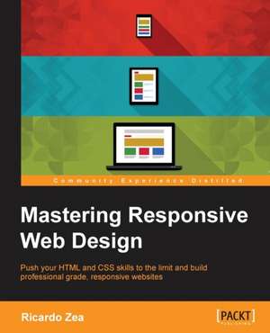
Mastering Responsive Web Design with Html5 and Css3: Innovating for the Greater Good
Autor Ricardo Zeaen Limba Engleză Paperback – 23 aug 2015
Push your HTML and CSS skills to the limit and build professional grade, responsive websites
Key Features
- Take your RWD skills to the next level with HTML5 and CSS3 best practices that will give you a solid foundation to build out from
- Harness the power of the CSS pre-processor Sass to speed up the creation of your CSS
- Each chapter dives deep in to different aspects of RWD and is designed to get you up to speed with the latest developments in professional web design
Book Description
Building powerful and accessible websites and apps using HTML5 and CSS3 is a must if we want to create memorable experiences for our users. In the ever-changing world of web design and development, being proficient in responsive web design is no longer an option: it is mandatory.
Each chapter will take you one step closer to becoming an expert in RWD. Right from the start your skills will be pushed as we introduce you to the power of Sass, the CSS preprocessor, to increase the speed of writing repetitive CSS tasks. We'll then use simple but meaningful HTML examples, and add ARIA roles to increase accessibility. We'll also cover when desktop-first or mobile-first approaches are ideal, and strategies to implement a mobile-first approach in your HTML builds.
After this we will learn how to use an easily scalable CSS grid or, if you prefer, how to use Flexbox instead. We also cover how to implement images and video in both responsive and responsible ways. Finally, we build a solid and elegant typographic scale, and make sure your messages and communications display correctly with responsive emails.
What you will learn
- Install and use Sass with SCSS syntax to create your CSS
- Use HTML5 tags the right way, for the right type of content
- Enhance the experience of users with assistive technology with ARIA roles
- Design with a desktop-first approach, but implement with mobile-first methodology
- Master your layouts by creating your own scalable CSS grid, or using Flexbox for total layout 'flexibility'
- Retrofit your old web sites with your new responsive design skills
- Deal with legacy browsers, and learn how to keep your designs consistent
- Implement widely used responsive patterns, such as the "drawer navigation", the "off-canvas" and the "flexbox-based" navigation patterns
- Find the best way to serve the right type of image and how to make videos responsive
- Build custom responsive emails to ensure the message gets across regardless of the device
Preț: 303.39 lei
Preț vechi: 379.23 lei
-20% Nou
58.07€ • 63.10$ • 48.81£
Carte tipărită la comandă
Livrare economică 21 aprilie-05 mai
Specificații
ISBN-10: 1783550236
Pagini: 334
Dimensiuni: 191 x 235 x 18 mm
Greutate: 0.58 kg
Editura: Packt Publishing Limited


