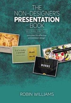
The Non-Designer's Presentation Book: Non-Designer's
Autor Robin Williamsen Limba Engleză Paperback – 13 aug 2017
- Exactly what makes a good presentation -- or a bad one
- How to plan, organize, and outline your presentation more effectively
- Four principles of designing effective presentations
- Four principles for designing beautiful slides that communicate clearly
- An exhaustive list of timeless presentation rules...that you should totally ignore
Preț: 170.22 lei
Preț vechi: 212.77 lei
-20% Nou
32.57€ • 34.16$ • 27.12£
Carte disponibilă
Livrare economică 11-25 martie
Livrare express 25 februarie-01 martie pentru 23.54 lei
Specificații
ISBN-10: 013468589X
Pagini: 192
Dimensiuni: 178 x 254 x 11 mm
Greutate: 0.36 kg
Ediția:2
Editura: Peachpit Press
Seria Non-Designer's
Notă biografică
1: Where to Begin?
What's a presentation?
Does it need to be digital?
Yes, it needs to be digital
Which slide size to use?
Both presenting and posting?
Where is your audience?
What's a bad presentation?
What's a good presentation?
Software options
Boundaries can be great
Templates and assets
Share your slides
2: Get yourself Organized
Plan, organize, outline, write
Now that you're organized
Four principles of presentation design (overview)
3: Clarity
Edit the text!
Spread out the text!
How many slides in a presentation?
Sometimes you need lots on one slide
4: Relevance
Get rid of superfluous stuff
Backgrounds
Don't use dorky clip art
Use relevant photos
5: Animation
Animation creates a focus
Concerns about animation
6: Plot
Make a beginning
Tell us where you're going
Text vs. images
Find the humans in the story
Tell relevant stories
Vary the pace
Make an end
And leave time for questions
Four principles of design (overview)
7: Contrast
Contrast with typeface
Contrast with color
Contrast provides substance
Contrast can help organize
Contrast demands attention
8: Repetition
Repeat to create a consistent look
Repeat a style
Repeat the image, but differently
Unity with variety
Design the repetitive elements
Repetition doesn't mean sameness
9: Alignment
Alignment cleans up individual slides
Alignment cleans up your deck
Alignment unifies your deck
Alignment makes you look smarter
Alignment is a great organizer
Alignment will need adjusting
Intentionally break the alignment!
10: Proximity
Create relationships
White space is okay
But avoid trapped white space
Proximity cleans and organizes
Proximity is a starting point
11: Handouts
Why include handouts
12: Learn your Software
Turn off "Autofit" or "Shrink text to fit"
Set the vertical alignment to the top
Adjust the space between lines
Adjust the space between paragraphs
Crop or mask an image
Don't squish the images
13: Ignore these Rules
Never read a slide aloud
Never use serif typefaces
Never use animation
Never use more than one background
Never make a slide without an image on it
Never use more than five bullet points per slide
Never use more than two or three words per bullet point
Never use PowerPoint
Never turn the lights off. Never turn the lights on
Never provide handouts before your talk
Never use pie charts
Never use Arial or Helvetica
14: Listen to your Eyes
Quiz: Listen to your eyes
Checklist for content
Checklist for slides
Put it all together
15: Resources
Cuprins
Robin Williams is the author of dozens of best-selling and award-winning books, including The Non-Designer's Design Book, The Little Mac Book, and so many more. Through her writing, teaching, and workshops, Robin has educated and influenced an entire generation of computer users in the areas of design, typography, desktop publishing, the Mac, and the web.


