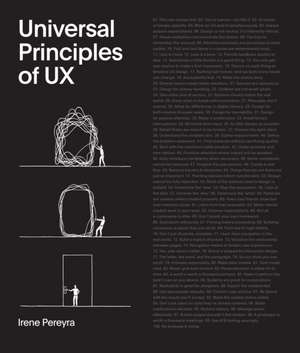
Universal Principles of UX: Rockport Universal
Autor Irene Pereyraen Limba Engleză Hardback – 9 mar 2023
Preț: 157.26 lei
Preț vechi: 194.70 lei
-19% Nou
Puncte Express: 236
Preț estimativ în valută:
30.10€ • 32.71$ • 25.30£
30.10€ • 32.71$ • 25.30£
Carte disponibilă
Livrare economică 31 martie-14 aprilie
Livrare express 15-21 martie pentru 92.27 lei
Preluare comenzi: 021 569.72.76
Specificații
ISBN-13: 9780760378045
ISBN-10: 0760378045
Pagini: 224
Ilustrații: 100+ photos
Dimensiuni: 220 x 256 x 22 mm
Greutate: 1.02 kg
Editura: Quarto Publishing Group USA, Inc.
Seria Rockport Universal
ISBN-10: 0760378045
Pagini: 224
Ilustrații: 100+ photos
Dimensiuni: 220 x 256 x 22 mm
Greutate: 1.02 kg
Editura: Quarto Publishing Group USA, Inc.
Seria Rockport Universal
Cuprins
Prologue
Chapter 1: Consider
About the Author
Index
Chapter 1: Consider
- The user comes first.
- You're human-act like it.
- UI makes or breaks usability.
- Work on UX and UI simultaneously.
- Always surpass expectations.
- Design is not neutral, it's inherently ethical.
- Visual metaphors communicate the fastest.
- The bias to remember the unusual.
- Attractive products are perceived as more usable.
- First and last items in a series are remembered most.
- Less is more.
- Less is a bore.
- Provide feedback quickly or else.
- Sometimes a little friction is a good thing.
- You only get one chance to make a first impression.
- There's no such thing as timeless UX design.
- Nothing lasts forever, and we both know hearts can change.
- Accessibility first.
- Make the choice easy.
- Diverse teams create better solutions.
- Devices are ubiquitous.
- Design for clumsy handling.
- Children are not small adults.
- Take extra care of seniors.
- Systems should match the real world.
- Know when to break with convention.
- Persuade, don't coerce.
- Allow for differences in digital literacy.
- Design for both novices & power users.
- Design for learnability.
- Design for passive attention.
- Make it unobtrusive.
- Avoid forced interruptions.
- Make notifications valuable.
- Minimize form input.
- As little design as possible.
- Rebel! Rules are meant to be broken.
- Choose the right client.
- Understand the problem first.
- Gather requirements.
- Define the problem statement.
- Find shortcuts without sacrificing quality.
- Start with the minimum viable product.
- Under-promise and over-deliver.
- Only introduce complexity when necessary.
- Some complexity cannot be reduced.
- Assume worst case scenario.
- Create a user flow.
- Remove barriers & obstacles.
- Things that are not there are just as important.
- Pointing devices inform functionality.
- Design cannot be fully objective.
- Most of the science used in design is bull.
- Determine the 'how'.
- Map the ecosystem.
- Look at the data.
- Uncover the 'why'.
- Determine the 'what'.
- Personas are useless unless created properly.
- Keep your friends close but your enemies closer.
- Learn from bad examples.
- Make mental models work in your favor.
- Uncover expectations.
- Not all e-commerce is alike.
- Most usability issues can be spotted a mile ahead.
- Brainstorm efficiently.
- Priming before presenting.
- Building consensus is easier than you think.
- From low to high fidelity.
- Don't just illustrate, annotate.
- Learn from navigation in the real world.
- Build a logical structure.
- Visualize the relationship between pages.
- Navigation makes or breaks user experience.
- Yes, side doors matter.
- The letter, the word, and the paragraph.
- Maintain consistent branding.
- So you think you can scroll.
- Animate responsibly.
- Make data lovable.
- Dark mode rises.
- Never give total control.
- Personalization is either hit or miss.
- A word is worth a thousand pictures.
- Make it perform the best it can on any device.
- Pattern library, style guide, or design system-choose one.
- Don't let design systems kill creativity.
- Expect the unexpected.
- An audible system status is awkward.
- Don't ask for unnecessary things.
- Manage errors effectively.
- Be liberal with the inputs you accept.
- Confirm user actions.
- Broken pages shouldn't feel broken.
- Fill the gap our imagination can't bridge.
- Metric-based design is silly.
- Don't grade your own homework.
- Prioritize attention where impact will be greatest.
- Stay involved in the project post launch.
- Re-evaluate & revise.
About the Author
Index
