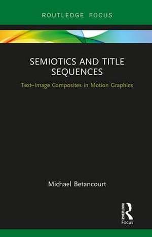
Semiotics and Title Sequences: Text-Image Composites in Motion Graphics: Routledge Studies in Media Theory and Practice
Autor Michael Betancourten Limba Engleză Hardback – 27 ian 2017
| Toate formatele și edițiile | Preț | Express |
|---|---|---|
| Paperback (1) | 167.93 lei 3-5 săpt. | +7.99 lei 4-10 zile |
| Taylor & Francis Ltd. – 12 dec 2019 | 167.93 lei 3-5 săpt. | +7.99 lei 4-10 zile |
| Hardback (1) | 466.60 lei 6-8 săpt. | |
| Taylor & Francis – 27 ian 2017 | 466.60 lei 6-8 săpt. |
Preț: 466.60 lei
Preț vechi: 548.94 lei
-15% Nou
Puncte Express: 700
Preț estimativ în valută:
89.28€ • 93.47$ • 73.88£
89.28€ • 93.47$ • 73.88£
Carte tipărită la comandă
Livrare economică 07-21 aprilie
Preluare comenzi: 021 569.72.76
Specificații
ISBN-13: 9781138634206
ISBN-10: 1138634204
Pagini: 144
Ilustrații: 35 Illustrations, black and white
Dimensiuni: 138 x 216 x 15 mm
Greutate: 0.29 kg
Ediția:1
Editura: Taylor & Francis
Colecția Routledge
Seria Routledge Studies in Media Theory and Practice
Locul publicării:Oxford, United Kingdom
ISBN-10: 1138634204
Pagini: 144
Ilustrații: 35 Illustrations, black and white
Dimensiuni: 138 x 216 x 15 mm
Greutate: 0.29 kg
Ediția:1
Editura: Taylor & Francis
Colecția Routledge
Seria Routledge Studies in Media Theory and Practice
Locul publicării:Oxford, United Kingdom
Public țintă
Postgraduate and UndergraduateCuprins
1. Theory and Design
2. The Figure-Ground Mode
3. The Calligram Mode
4. The Rebus Mode
5. Subtitles and Calligrams
6. Conclusions
2. The Figure-Ground Mode
3. The Calligram Mode
4. The Rebus Mode
5. Subtitles and Calligrams
6. Conclusions
Notă biografică
Michael Betancourt is a theorist, historian, and artist concerned with digital technology and capitalist ideology. He is the author of The ____________ Manifesto, The History of Motion Graphics, Beyond Spatial Montage, Glitch Art in Theory and Practice, and The Critique of Digital Capitalism. He has exhibited internationally, and his work has been translated into Chinese, French, German, Greek, Italian, Japanese, Persian, Portuguese, and Spanish, and published in journals such as The Atlantic, Make Magazine, CTheory, and Leonardo.
Descriere
Title sequences are the most obvious place where photography and typography combine on-screen, yet they are also a commonly neglected part of film studies. Semiotics and Title Sequences presents the first theoretical model and historical consideration of how text and image combine to create meaning in title sequences for film and television, before extending its analysis to include subtitles, intertitles, and the narrative role for typography. Detailed close readings of classic films starting with The Cabinet of Dr. Caligari, and including To Kill A Mockingbird, Dr. Strangelove, and The Good, the Bad and the Ugly, along with designs from television programs such as Magnum P.I., Castle, and Vikings present a critical assessment of title sequences as both an independent art form and an introduction to the film that follows.
